2 years ago
Hey y'all,
Today, we're launching the GA of our new Observability Dashboard! ✨
You can get access by enabling the feature flag under your account settings. Once enabled, visit any of your projects and click the "Observability" button in the all-new navigation bar.
You can start with either a default dashboard or create your own from scratch. At the moment, we have 3 types of items you can add:
Resource Metrics
You can view resource (CPU, Memory, Network, Disk) usage metrics across services at the same time.
Example of disk usage metrics for all volumes in a project 👇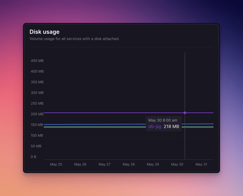
Logs
You can create an item with your own custom log filter. The filter query language is the same as on the Log Explorer page.
Example of a log item for viewing error logs for all services in a project 👇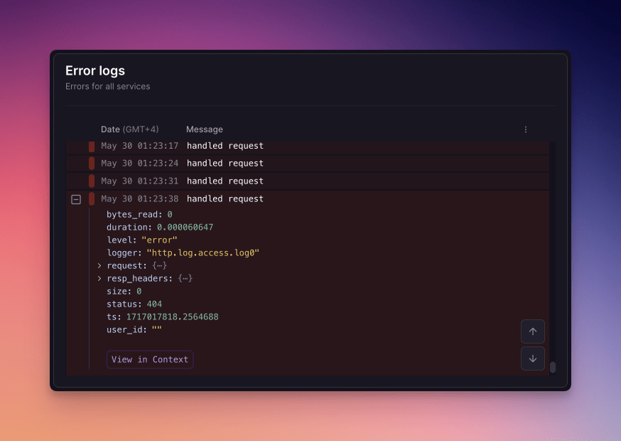
Project Usage
You can view a breakdown of resource usage across the current billing period. It gives you an overview of your costs and can be customized down to each property.
Example of a full-fledged Project Usage item 👇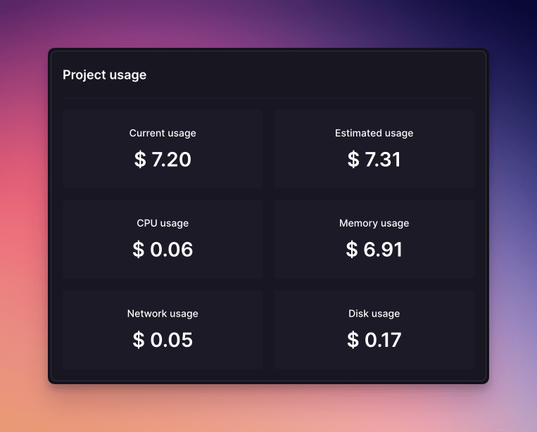
We'd love for you to try the feature and give us your feedback. Let us know what you like, what you don't like, and what else you'd like to see. Feel free to share your dashboards in here as well!
👋

0 Threads mention this feature
55 Replies
2 years ago
Project usage tab doesn’t seem to work for me using the simple dashboard display.
Displays all $0.00

2 years ago
Nice improvement! To me, it would be very useful to be able to set alerts based on user-defined thresholds.For instance, I might want to be notified via mail if my services exceed 2 GBs of memory usage
2 years ago
Can you give an instance one color to be always the same? CPU usage shows a different color code for an instance than memory usage.
2 years ago
It's looking great so far! Some initial feedback:- The smallest chart vertical size is huge! - In general, I would love more compact widgets. They have a lot of padding and the header is very large- Hovering the heading makes the content jump to show the extra description- It's frustrating to have to grab the little "move handle"- Would be nice to have every corner/edge be able to drag to resize- "Provide Feedback" button covers the drag handle of bottom-right widget(Edit: Looks like I lost all my formatting in this comment)
2 years ago
The forum now uses tip tap for format editing, so there are some bugs to work out still haha
2 years ago
Nice improvement! To me, it would be very useful to be able to set alerts based on user-defined thresholds.For instance, I might want to be notified via mail if my services exceed 2 GBs of memory usage
For sure. It's a little bit away but the eventual plan here is to left you define alerts on top of the widgets you create in these dashboards!
2 years ago
Can you give an instance one color to be always the same? CPU usage shows a different color code for an instance than memory usage.
I am going to play around a bit with colors either this week or the next. There's some nuance to work out though:
- After a certain number of services, the colors can't really be unique and there will be some form of similarity/collision between services across charts, I wonder how much having the same color helps at that point.
- On a similar note as above, if you have a lot of services, would you really use color to identify them or would labels and filters make more sense?
2 years ago
I don't have a large amount of services right now, hence I would try to identify them by color. If I check the CPU usage chart and my service X is green, I expect it to be green on the memory and disk chart as well.
2 years ago
The smallest chart vertical size is huge!
I went back and forth on minH but for some reason after reason this, it seems obviously huge, haha! IIRC it's 3 units right now, I'll probably bump it down to 2 and take it from there.
Hovering the heading makes the content jump to show the extra description
This is a bug. Will fix! (And will also look into the more compact charts feedback).
It's frustrating to have to grab the little "move handle"- Would be nice to have every corner/edge be able to drag to resize
Hmm, so this was intentional because it felt too noisy otherwise? Originally, you could just drag the whole card around. But, we didn't really have edit mode back then so maybe that's why it felt noisy. I'll put this down as a wait and see in terms of how many people complain about it. :P
"Provide Feedback" button covers the drag handle of bottom-right widget
Will fix!
2 years ago
I don't have a large amount of services right now, hence I would try to identify them by color. If I check the CPU usage chart and my service X is green, I expect it to be green on the memory and disk chart as well.
FWIW this will be the short term solution. I guess what I was looking for with that comment was whether you'd use the same notion for identification if you did have a lot of services or would you prefer some form of global filtering mechanism?
2 years ago
Would use the same method, additional to labels.
2 years ago
Small UX feedback: - "Add item" should be "Save item" or something similar when updating instead of creating new- Sometimes you can't move resized panel above the not-resized one, you have to resize both only then it works
2 years ago
Update:
- Cards can now have a smaller height than before.
- Feedback button doesn't cover the resize trigger on the bottom-most widget.
- Hovering to view description doesn't cause any layout shift.
2 years ago
I don't have a large amount of services right now, hence I would try to identify them by color. If I check the CPU usage chart and my service X is green, I expect it to be green on the memory and disk chart as well.
This is done. Your resources will now re-use the same color across different widgets!
2 years ago
Nice. Thank you!
2 years ago
Just a thought: I would find helpful to be able to set custom colors (even defined by their hex code?) for each service. Since we might associate them with a specific color (based on their logo, etc), this can improve dashboards' immediacy.
2 years ago
Hello I was wondering if we can get a "count" or "total" on this particular tile. Reason for this is it'll make it a lot more valuable. It'll show logs but gives the user an opportunity to configure logs to show many times an endpoint has been hit for example or what is the error ratio for an endpoint or even the error rate across the board.
2 years ago
It's very strange to me that the Railway team implemented this kind of dashboard instead of just adding log drain functionality.
If your goal is to do everything in-house, we NEED alerts. Your serious customers must be able to trigger alerts (email, Slack, etc) based on application output.
It seems like Railway wants to build an observability product similar to BetterStack, which isn't ideal but would at least get the job done.
2 years ago
I'm a huge fan of this new feature. This would be unbelievably useful to me if I had the ability to embed this view in an Iframe - I'd even pay extra for this feature. Embedding these logs directly in another dashboard would be incredibly helpful. Are there any plans to generate sharable versions of the dashboard a la Plausible?
Thanks
2 years ago
We agree that would be a cool feature to have but it's just not possible right now, all that data uses your login token, and so the embed would need access to that too, this would only be do-able if we introduced some finer grained permission controls, and that's unfortunately not something we could do right now, but thank you for the feedback!!
2 years ago
I love this feature. Expect to upgrade to Pro soon, just testing out the platform for now.
As for this feature, I'd love if there were "templates" for different use cases, resizing of windows, and multiple "pages" or "tabs" so that I can create one for project usage, one for errors, etc.
All the best!
a year ago
I love the feature, but I think it would be even better if there was an option to create tabs or sections. I’ve deployed 3 services in my project and created individual cards for each, along with a common card for all services. So, I have to scroll quite a bit to view a specific service graph.
Also, it would be really useful if there were an option to resize the cards.
a year ago
Hello, you can resize the cards, click the Edit button and then use the resize handle to drag to the size you want! once done, click Save.
a year ago
I've been really enjoying the observability dashboard but it's almost impossible for me to rearrange the panels. They seem to have a mind of their own and move around quite a bit after saving a layout.
(I tried to attach a video to this thread but it doesn't seem to be uploading, you can contact me on discord if you do want a video 🙂)
jasperchess
I've been really enjoying the observability dashboard but it's almost impossible for me to rearrange the panels. They seem to have a mind of their own and move around quite a bit after saving a layout. (I tried to attach a video to this thread but it doesn't seem to be uploading, you can contact me on discord if you do want a video 🙂)
a year ago
Can you open a #feedback thread in our discord server so you can share the video?
a year ago
Love the observability dashboard! Is there any chance we'll get HTTP Logs in there any time soon?
Status changed to Completed unicodeveloper • over 1 year ago
a year ago
This is an awesome feature — great work, team!
One thing that would make it even more powerful is support for alerting and log drains. Until building in-house alerting and analytics, it would be super helpful to have built-in ways to trigger alerts (like email or Slack) based on log output.
I'm sure a lot of teams would benefit from this kind of observability — especially during critical production deployments or error spikes.
Would love to see this added!
a year ago
Yeah. We still don't have Slack alerts based on log output. It's really quite sad the Railway team hasn't prioritised this.
We have to resort to service-internal workarounds to actually pipe our logs somewhere that can do alerting, like Papertrail.
Alerting based on (structured) log output is table stakes for any prod service.
vijay-sleek
This is an awesome feature — great work, team! One thing that would make it even more powerful is **support for alerting and log drains**. Until building in-house alerting and analytics, it would be super helpful to have built-in ways to **trigger alerts (like email or Slack) based on log output**. I'm sure a lot of teams would benefit from this kind of observability — especially during critical production deployments or error spikes. Would love to see this added!
a year ago
Perfect timing—our team is kicking off work this quarter to bring custom alerts to Railway!
We’d love to hear how you would use alerts and what you’d expect from a built-in solution. Keep an eye on our Public Roadmap for updates, and feel free to drop any comments or feature requests there—we’re all ears!
isaac-hinman
Yeah. We still don't have Slack alerts based on log output. It's really quite sad the Railway team hasn't prioritised this. We have to resort to service-internal workarounds to actually pipe our logs somewhere that can do alerting, like Papertrail. Alerting based on (structured) log output is table stakes for any prod service.
a year ago
We totally hear you and we're committed to changing that this quarter! The team is beginning the work to bring alerting to Railway and we hop you'll join us for the ride as we work on it.
We’d love to hear how you would use alerts and what you’d expect from a built-in solution (Slack alerts is a good one, we'll definitely keep that in mind).
Keep an eye on our Public Roadmap for updates, and feel free to drop any comments or feature requests there—we’re all ears!
a year ago
We’d love to hear how you would use alerts and what you’d expect from a built-in solution
Well, it's disappointing to hear you imply you will not be adding industry-standard log drain functionality... If you truly want to keep everything in-house, yes – Slack alerts based on any arbitrary log query is what is needed by our team, specifically.
a year ago
The new observability dashboard is nice, one piece of feedback that would really help our team is granular breakdowns of the network egress. Currently the network egress just shows egress in aggregate without any information of where or what that egress is attributed to. If we could see a breakdown such as the domains or individual requests which are adding to the network egress, that would help a lot in identifying areas to optimize and improve within our application. Not sure if this is possible to do from Railway, but if it is it would be tremendously helpful.
a year ago
The vertical bar should be displayed on ALL graphs, not just the one I'm mousing over. This would help tremendously with visual correlation of events across multiple resources.
a year ago
Recently I think you changed the logics in the "Project usage" block. Before, if I'm not mistaken, it was displaying the usage for the whole current billing period, now it's synchronised with the global Period selector. Now there is no way to see exactly how much we spent for the billing period. Please either:
- add the option "Current billing period" in the global Period selector
- or add a checkbox to the "Project usage" block to only take in consideration the billing period, as it was before
Thanks
davidmelnychuk
The new observability dashboard is nice, one piece of feedback that would really help our team is granular breakdowns of the network egress. Currently the network egress just shows egress in aggregate without any information of where or what that egress is attributed to. If we could see a breakdown such as the domains or individual requests which are adding to the network egress, that would help a lot in identifying areas to optimize and improve within our application. Not sure if this is possible to do from Railway, but if it is it would be tremendously helpful.
a year ago
Late but when you mean breakdown, do you mean like being able to see all of the sources of traffic and then logging them out?
10 months ago
- It would be great if OD Logs had the same “Railway tags” (replica, service, deployment) and “Custom columns” options as Log Explorer for consistency.
- In OD Logs, having the same JSON viewer that opens when clicking a log in Log Explorer would make inspecting entries much easier.
- For graphs, the ability to drill down to individual replicas within a service would give a clearer picture of each replica’s health.
- It would also help if the Y-axis rescaled when services are deselected, so lower-usage services don’t get flattened by high-usage ones.
angelo-railway
Late but when you mean breakdown, do you mean like being able to see all of the sources of traffic and then logging them out?
10 months ago
Yeah essentially being able to see the sources, e.g in our case the service makes lots of requests to different third party APIs, if it's possible to track the request URL that egress originates from then we can do URL prefix/source filtering to see things like 80% of the egress is going towards a particular AI provider, 10% towards uploading images to S3, etc.
9 months ago
Awesome feature. I'm using Observability dashboard to monitor my usage, and I'm trying to reduce it (if you have any documentation on this, I'd really appreciate it) since this is just an n8n template with a single workflow.
Good job.
parker
We totally hear you and we're committed to changing that this quarter! The team is beginning the work to bring alerting to Railway and we hop you'll join us for the ride as we work on it. We’d love to hear how _you_ would use alerts and what you’d expect from a built-in solution (Slack alerts is a good one, we'll definitely keep that in mind). Keep an eye on our [Public Roadmap](https://station.railway.com/feedback/custom-alerting-metrics-logs-etc-5b9fbf6c) for updates, and feel free to drop any comments or feature requests there—we’re all ears!
9 months ago
Any updates on this? You mentioned commitment to changing that this quarter 5 months ago. Not having log drains AND not having log alerts is killing us. We need one or the other
9 months ago
We just migrated our company from render to railway, all our product and the observability dashboard is great to have inside the project and works greeat for us.
One feedback is that it would be great to have a bloc for the request (API project) like:
nb of req/day/hour/min
filter by request type: 404/401/200...
this feature was available on render and i cant see it here, other than this we love the interface/features.
vijay-sleek
This is an awesome feature — great work, team! One thing that would make it even more powerful is **support for alerting and log drains**. Until building in-house alerting and analytics, it would be super helpful to have built-in ways to **trigger alerts (like email or Slack) based on log output**. I'm sure a lot of teams would benefit from this kind of observability — especially during critical production deployments or error spikes. Would love to see this added!
8 months ago
+1 on this. Having built-in monitoring for error logs would be super helpful
7 months ago
would be really nice if any of the dashboard items can be larger and occupy more space than just one grid space. Specifically telling this for error logs, it would be much easier to see the logs if its box was wider
7 months ago
It's nice. But I can see that a month ago disc usage increase twice. can you clarify how can I see what for I can use it?
7 months ago
Would be good to copy stats as json
7 months ago
Hi there - is there an API for billing data or this observability dashboard? I'd like to be able to pull at least once a day so I can use the data in a rollup dashboard I need to build.
6 months ago
From past couple days, I cant reposition my blocks and whenever I try to edit the block it gives me error snackbar "Problem Processing request" I am attaching my console screenshot also.
Attachments
6 months ago
it's ok. it used to break my layout if my window ever changed size, but in the past week it's been more stable. in my opinion the best layout is like this, would make a better default.
6 months ago
I forgot to leave my main complaint. You can't change the time scale; instead you have to pick some service in architecture view and change it in the metrics tab, then come back to observability tab. Bizarre design
5 months ago
It would be cool to have a preset feature, so I could save the way I customized my dashboard and then easily import it into a new environment
5 months ago
Is it normal that all the dashboard widgets display "No data available" and all the usage counters are 0?
[edit] problem solved this morning
4 months ago
Unfortunately that dashboard is global, would be awesome if we could select an optional environment to see the cost/usage per env.
thanks for considering
3 months ago
I opened a support ticket, it appears as though the data is not showing up in the graphs for CPU usage, Memory usage, and Network egress. It was working fine a couple days ago. When I hover over the graphs the data pops up, but the lines are still hidden. Here's a console error I received as well:
Error: attribute viewBox: Expected number, "0 0 100% 129px".
Seems like a rendering issue.